
DESIGN & TREND
3daysofdesign 2026 Report | Design Beyond “Newness”: Towards Layering Value
2026/08/31
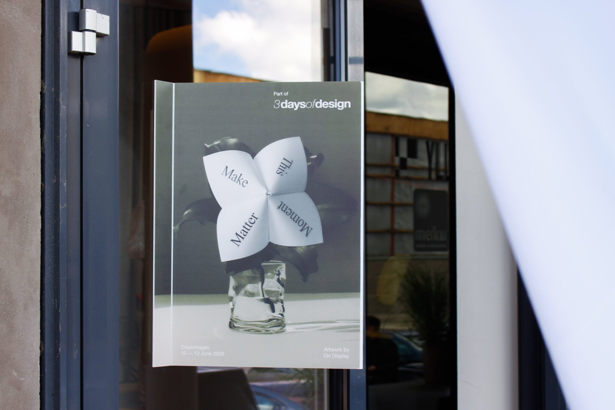
Table of Contents
- Re-examining Products as “Works of Art”
- Embedding Richness in Stillness
- Materials: Moving from Explanation to Experience
- Immersing in the Brand’s Universe
- "Layers of Meaning" Born Through Layering
3daysofdesign, an event where visitors can experience the forefront of Nordic design trends that continue to attract global attention, was held again this year in Copenhagen, Denmark, from June 10 to 12. Copenhagen in June usually offers a refreshing pre-summer climate to enjoy, but with visitor numbers growing year after year, this edition saw a particularly notable increase in exhibitors and attendees from Japan.
This year's theme was "Make This Moment Matter". Spanning eight Design Districts, over 460 brands participated and hosted more than 600 events. What stood out across the venues was the dedicated effort to convey brand values as immersive "experiences"—leveraging materials, light, sound, fragrance, and craft.
More than ever, this year’s 3daysofdesign featured exhibitions that were carefully designed not only in terms of what to display, but also how visitors would receive and absorb it. Here is an overview of 3daysofdesign 2026, shared through the lens of TOPPAN.
Re-examining Products as “Works of Art”
The first striking element was how exhibitions detached furniture and lighting from everyday living scenes, directing focus toward the forms and underlying narratives themselves.
HAY chose the contemporary art institution O–Overgaden as its venue, placing past, present, and upcoming designs within the same space. By allowing products from different eras to resonate with one another, the curation encouraged visitors to consider not just individual forms, but the relationships between designs. Vitra and Fredericia similarly displayed new pieces alongside archives, presenting the time accumulated by their brands as a singular narrative.
Rather than competing over "what is new", these brands layered the past with the present to bestow new meaning upon familiar products. The exhibition spaces served as quiet stages for deciphering brand history.
HAY
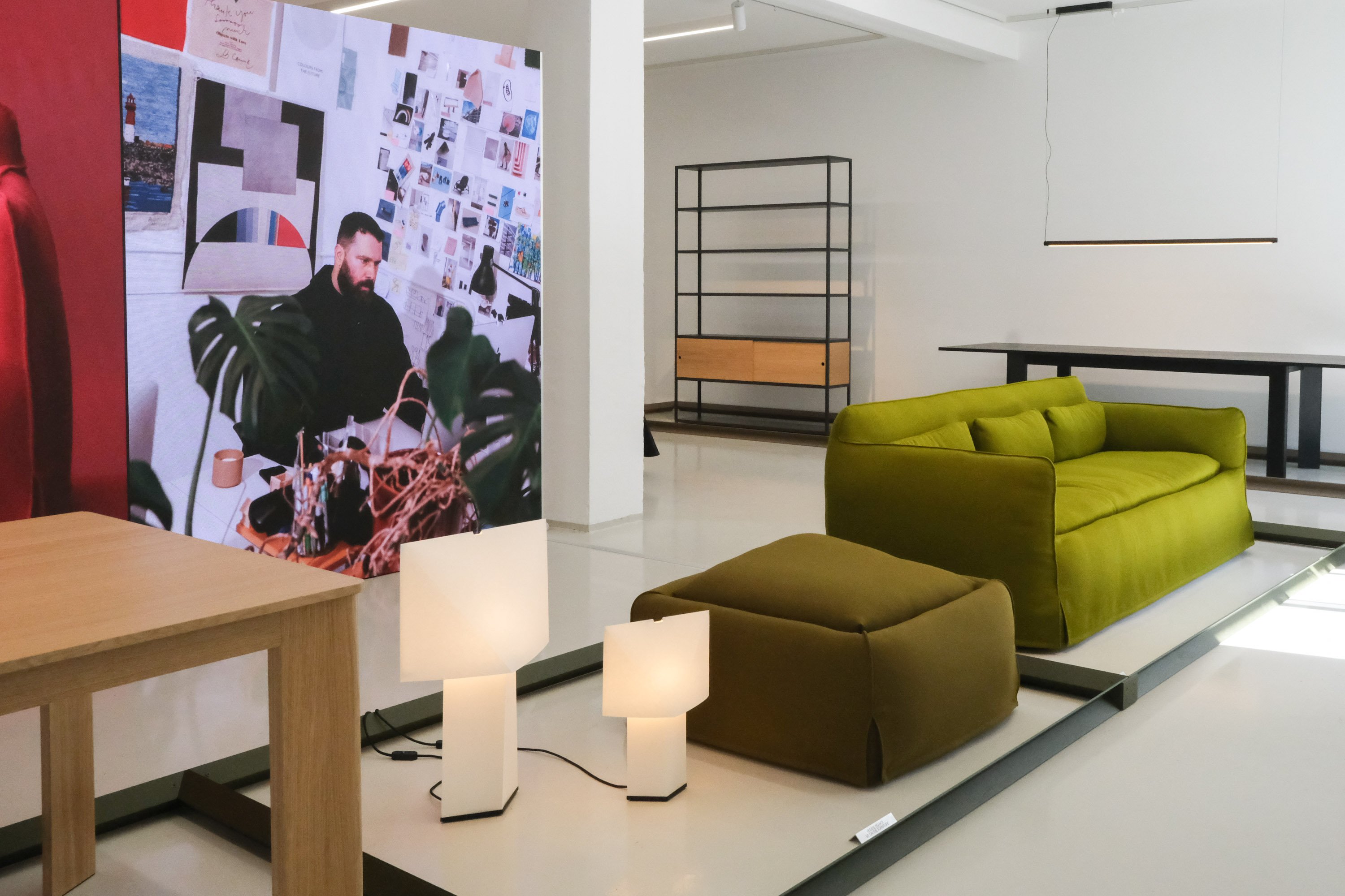
Moving away from its flagship HAY House venue used in previous years, HAY unveiled a new exhibition space. Alongside current collection items, the brand presented new releases, including the Mimi Sofa by Philippe Malouin and the Pack Chair by Jasper Morrison. Within a simple setting, HAY’s signature pop color palette and playful forms authentically expressed the brand’s identity.
Fredericia
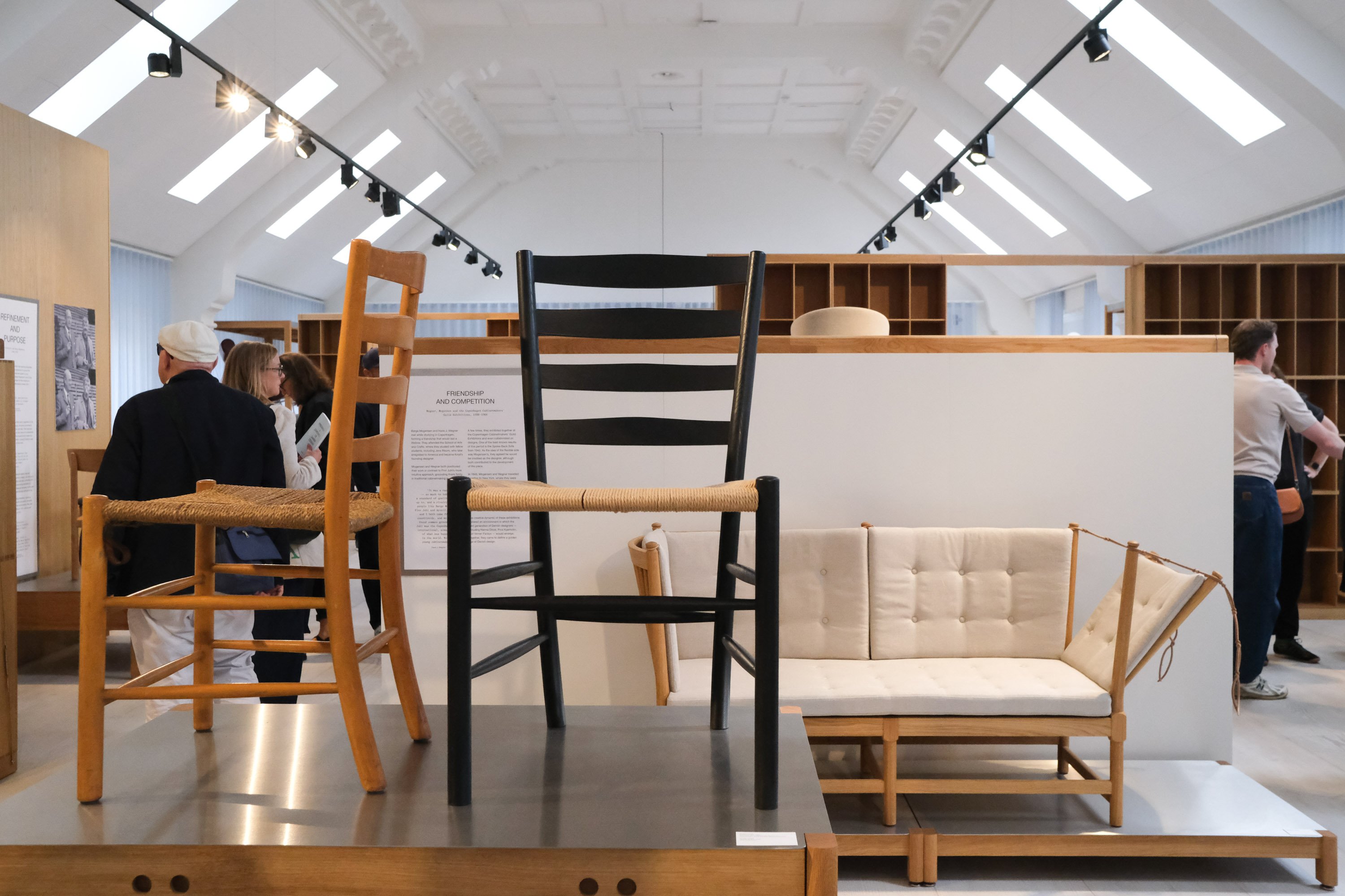
Fredericia reconfigured its exhibition "Fredericia: A Chronicle of Danish Design"—originally presented in Milan—for its Copenhagen showroom. Showcasing historical furniture, archival documents, and contemporary products across multiple spaces, the brand traced over a century of Danish furniture design history. The presentation left a lasting impression by emphasizing the continuous heritage passed down through Danish design to the present day.
Vitra
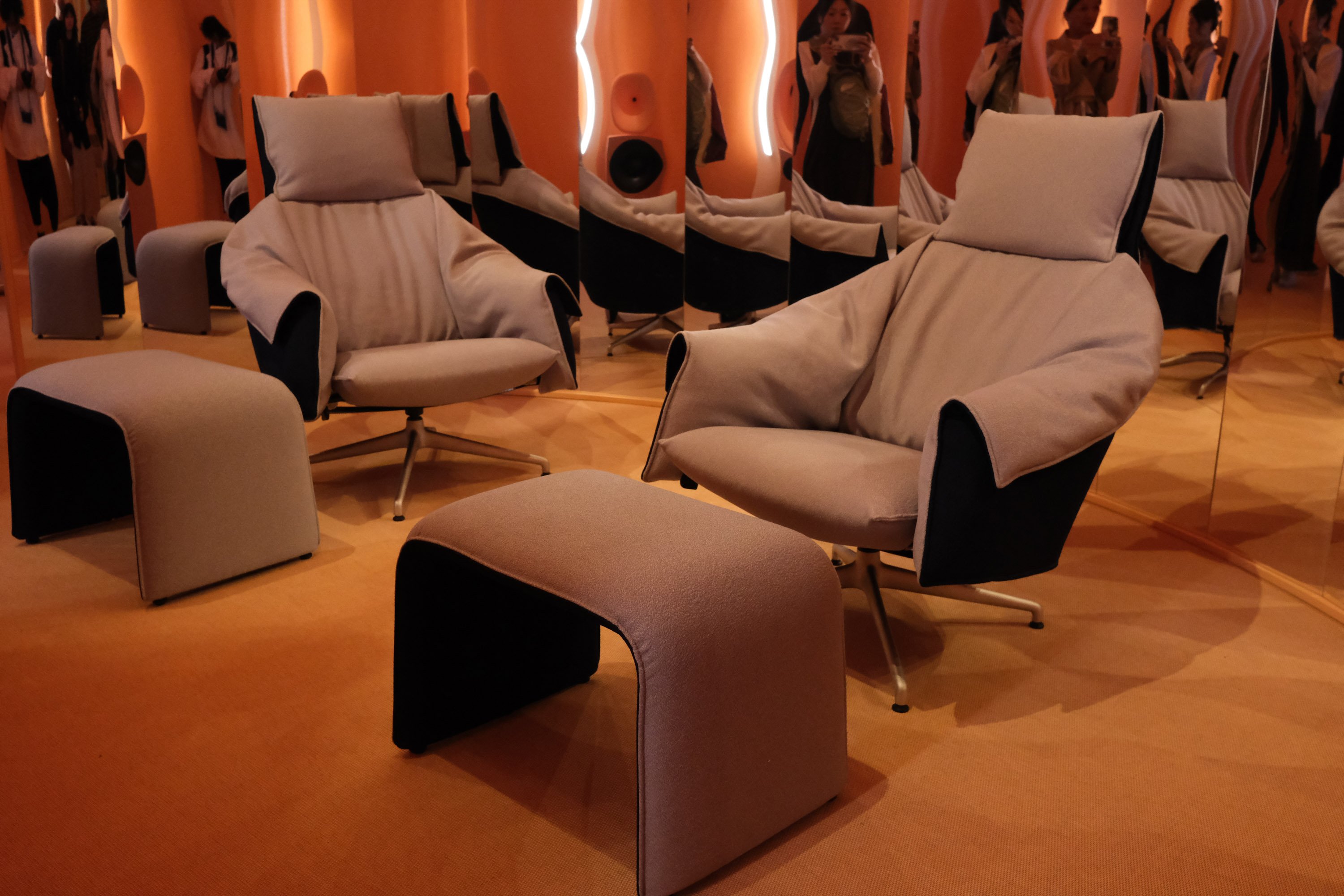
Vitra displayed its 2026 novelties alongside iconic archival works, showcasing a continuum of design from past to present. In a space wrapped in warm orange fabric, centered around the new "Bascule" lounge chair co-developed with Studio Œ, the exhibition featured limited-edition furniture celebrating the 100th anniversary of Verner Panton's birth, alongside the Panton Cubes.
Embedding Richness in Stillness
Exhibitions by brands like Audo, &Tradition, and GUBI brought forth images of serene, refined living. Muted color palettes, soft lighting, natural materials, and ample negative space created an elevated atmosphere—not through overt flashiness, but through the seamless harmony of furniture, lighting, and architecture.
The foundational palette relied on neutral tones such as warm white, sand beige, greige, and stone gray. Subdued accents like butter yellow, dusty blue, and oxblood were layered in, adding a gentle rhythm to the space without compromising the natural texture of the materials.
Future luxury may lie not in eye-catching opulence, but in a quiet stillness that invites you to stay longer.
AUDO Copenhagen
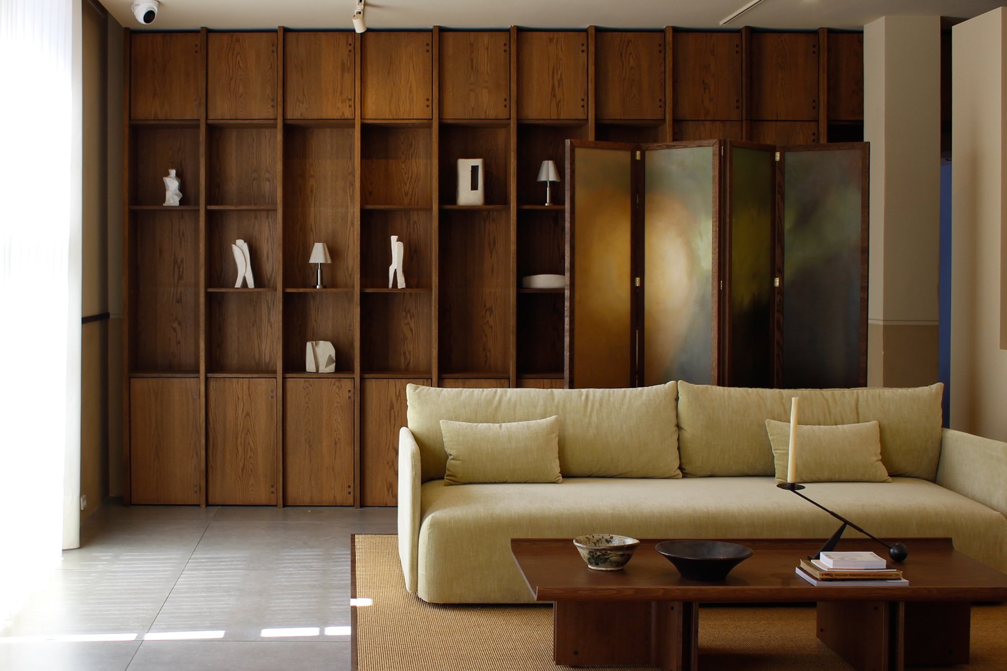
Under the theme "Quiet Grandeur", AUDO Copenhagen proposed a calmer, more sustainable vision for contemporary living. The venue showcased seven new releases alongside the existing collection, creating a space where old and new products harmonized naturally. In addition to a display commemorating the 90th anniversary of the iconic "The Tired Man" lounge chair, the brand curated experiential programs—including a bar and cinema room—allowing visitors to immerse themselves in the brand's worldview across the entire building.
&Tradition
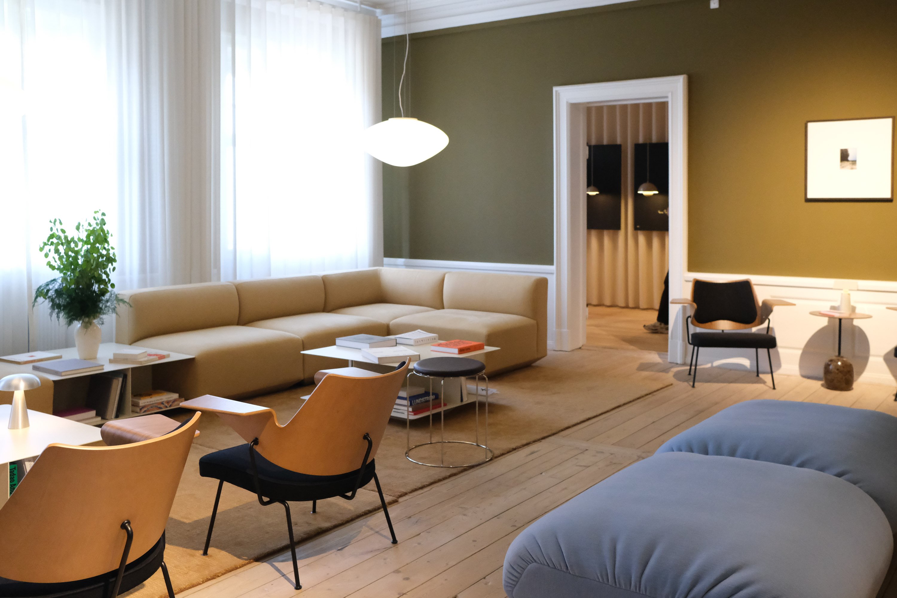
Centered on the theme "Traces", &Tradition hosted an exhibition tracing the legacy of design, craft, and culture. Through new additions to the "Rely" series by Hee Welling and displays honoring Verner Panton’s centenary, the brand seamlessly linked modern collections with its heritage. Understated styling that accentuated subdued colors and tactile materials allowed each product to naturally dissolve into the space, evoking a serene and elevated way of living.
GUBI
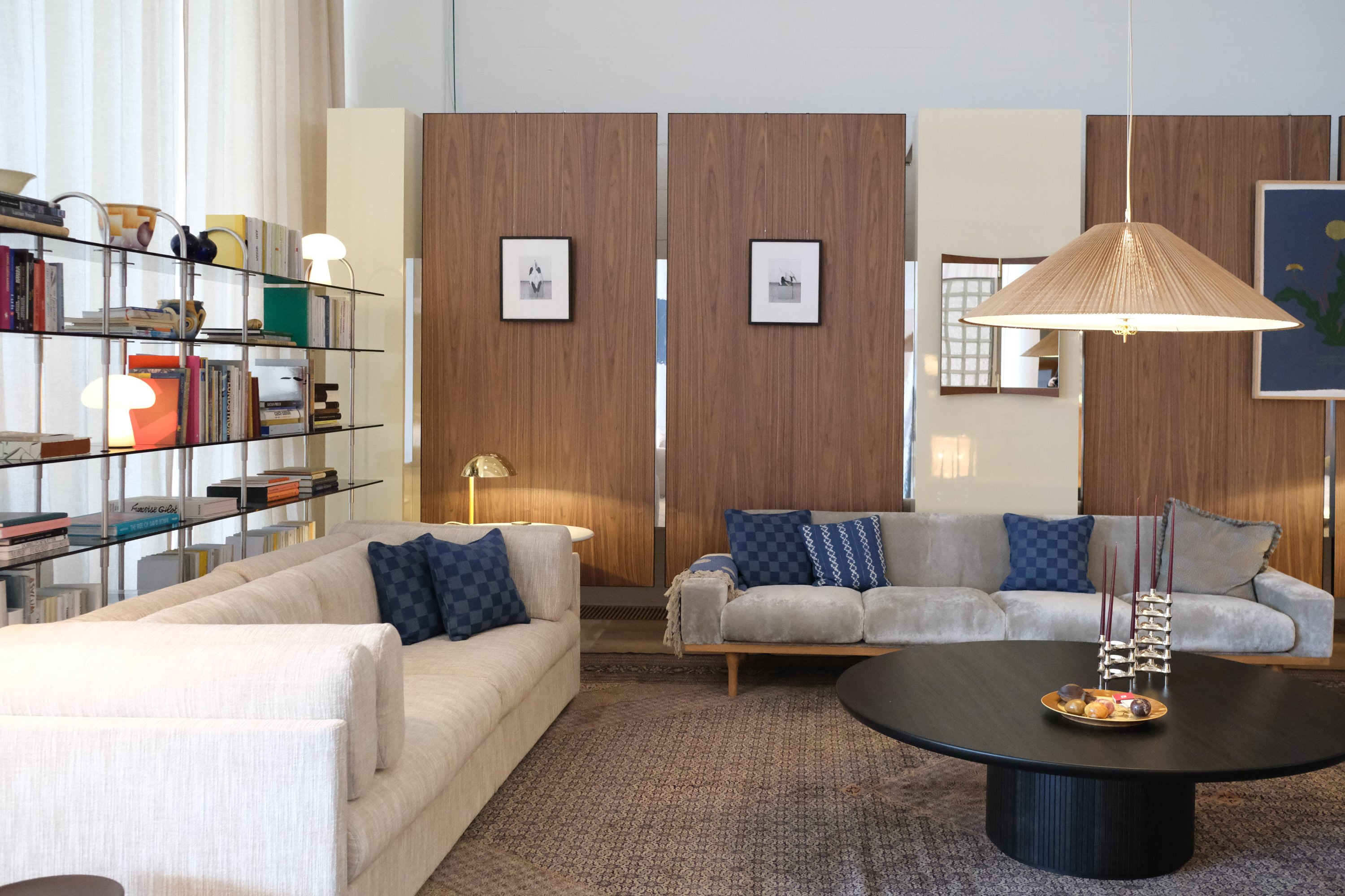
At "GUBI SCENES", new products were unveiled within four distinct spaces designed to evoke everyday living contexts, such as living and dining areas. By pairing calm color palettes and gentle light with furniture, lighting, and artwork from different eras, GUBI offered a sophisticated lifestyle vision. The venue featured pieces like the Hornbæk Portable Lamp, Brim Chair, Totto Stool, and the reissued Lotus Lamp, captivating visitors with refined styling that blurred the line between residential and hospitality spaces.
Materials: Moving from Explanation to Experience
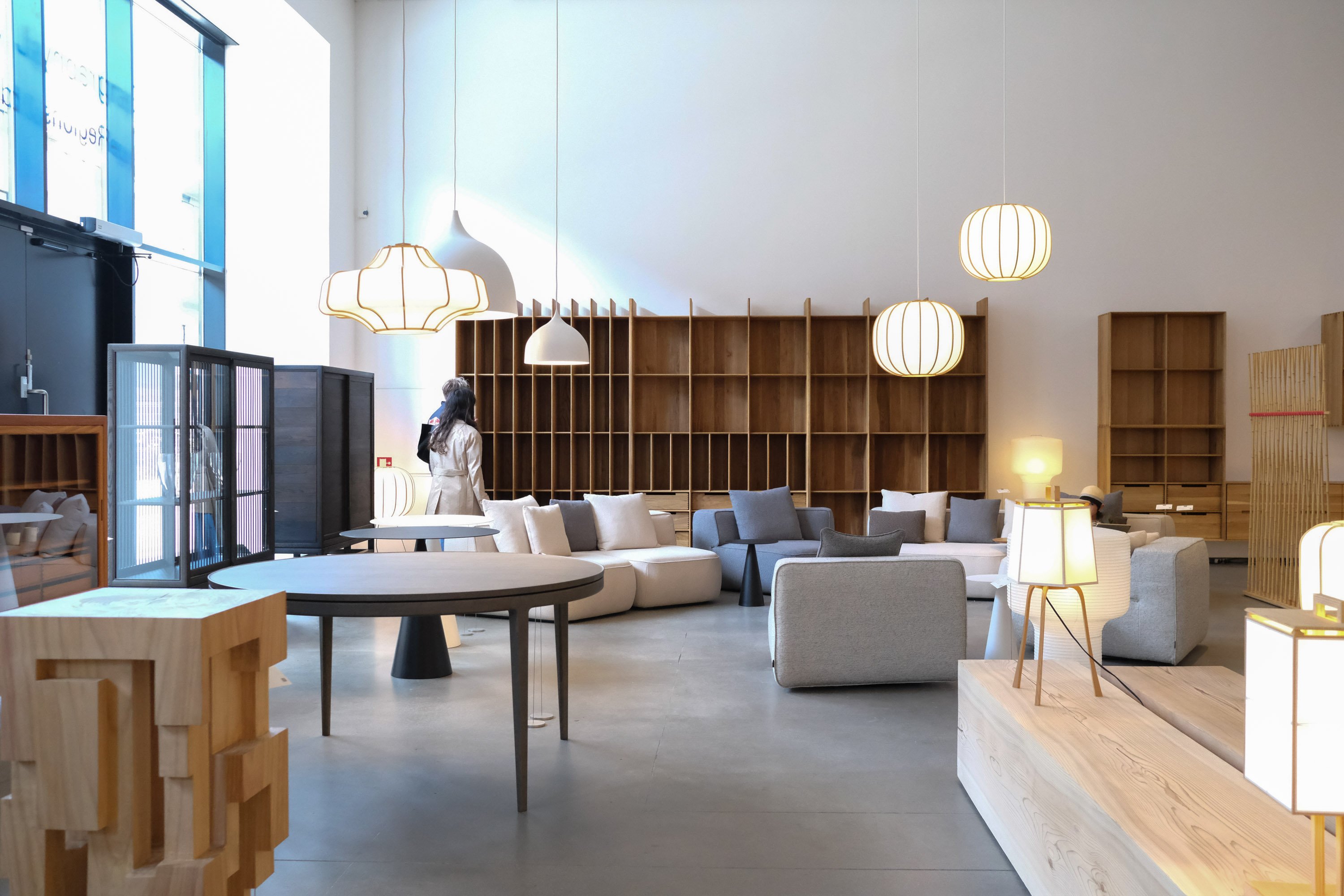
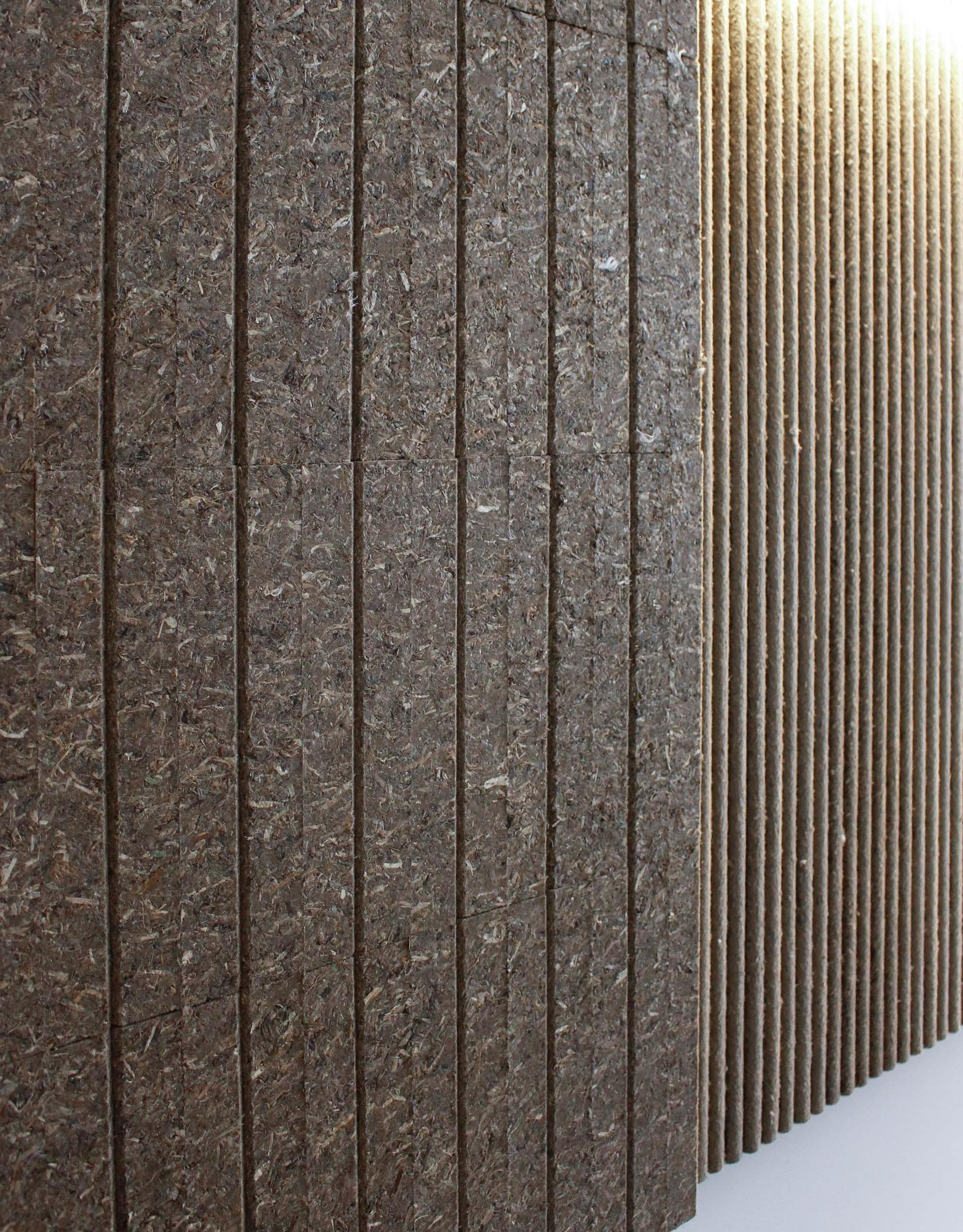
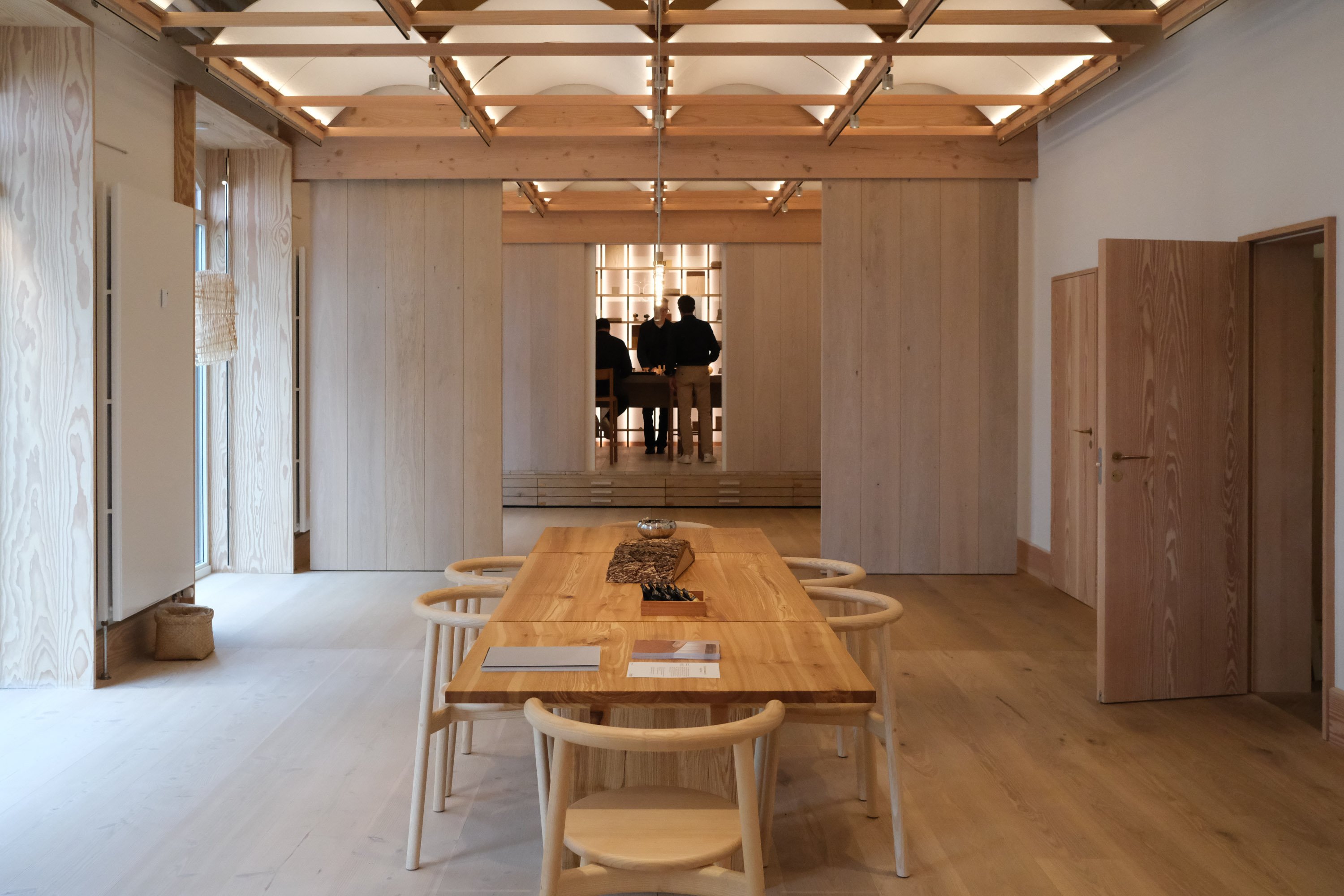
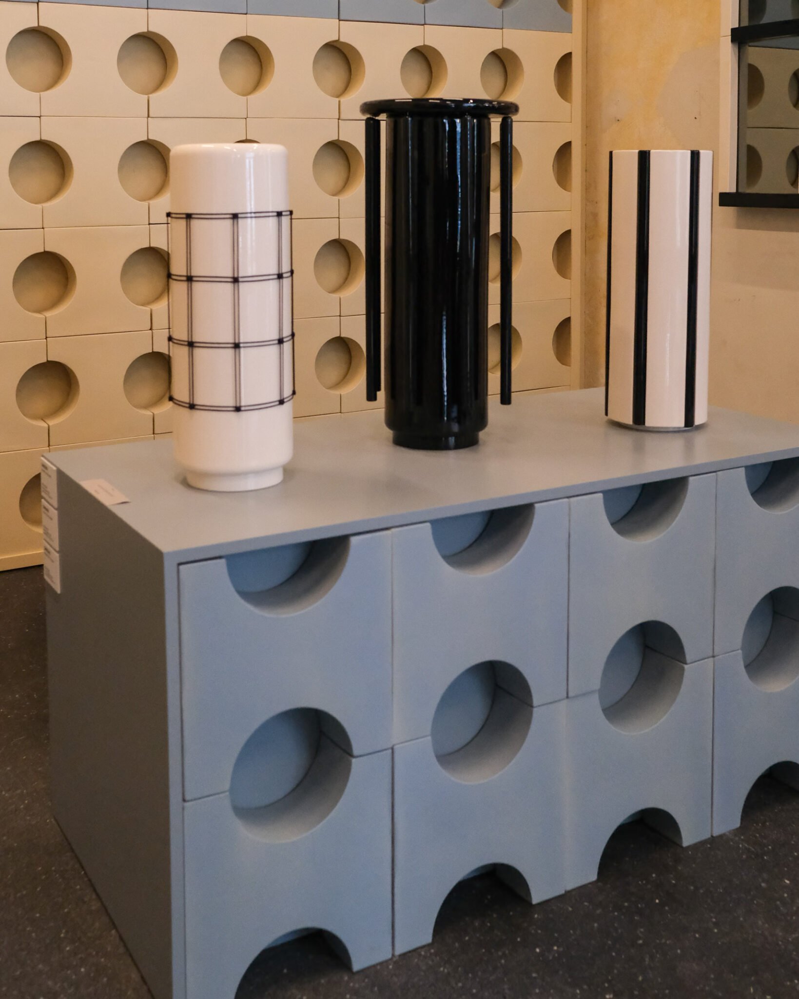
A clear shift was also evident in how materials were presented. Søuld presented acoustic panels made from eelgrass as a light-and-shadow installation. Dinesen seamlessly extended timber from floors to walls and ceilings, while MUTINA utilized three-dimensional ceramics for wall surfaces, partitions, and fixtures. A notable characteristic this year was that many brands let materials define the space, rather than merely lining them up with explanatory labels.
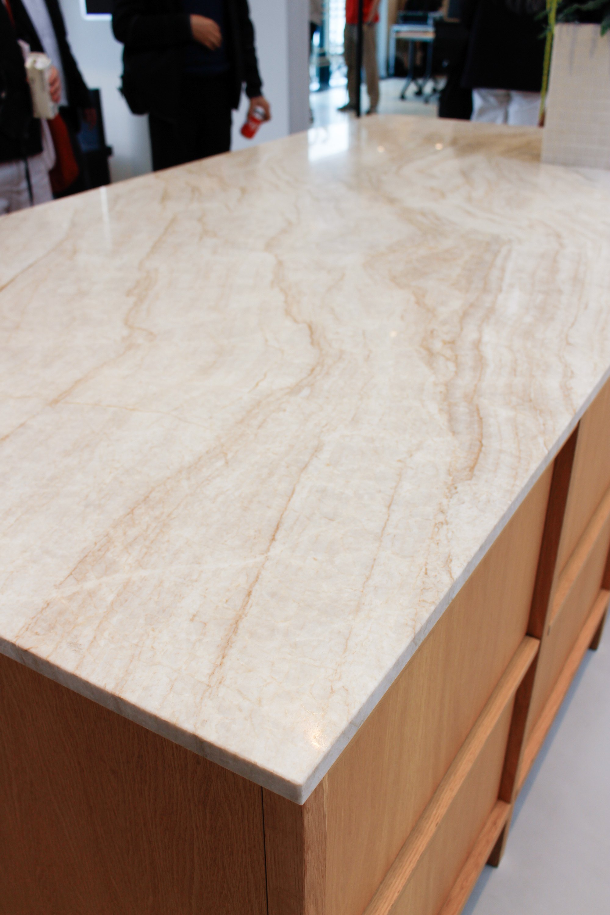
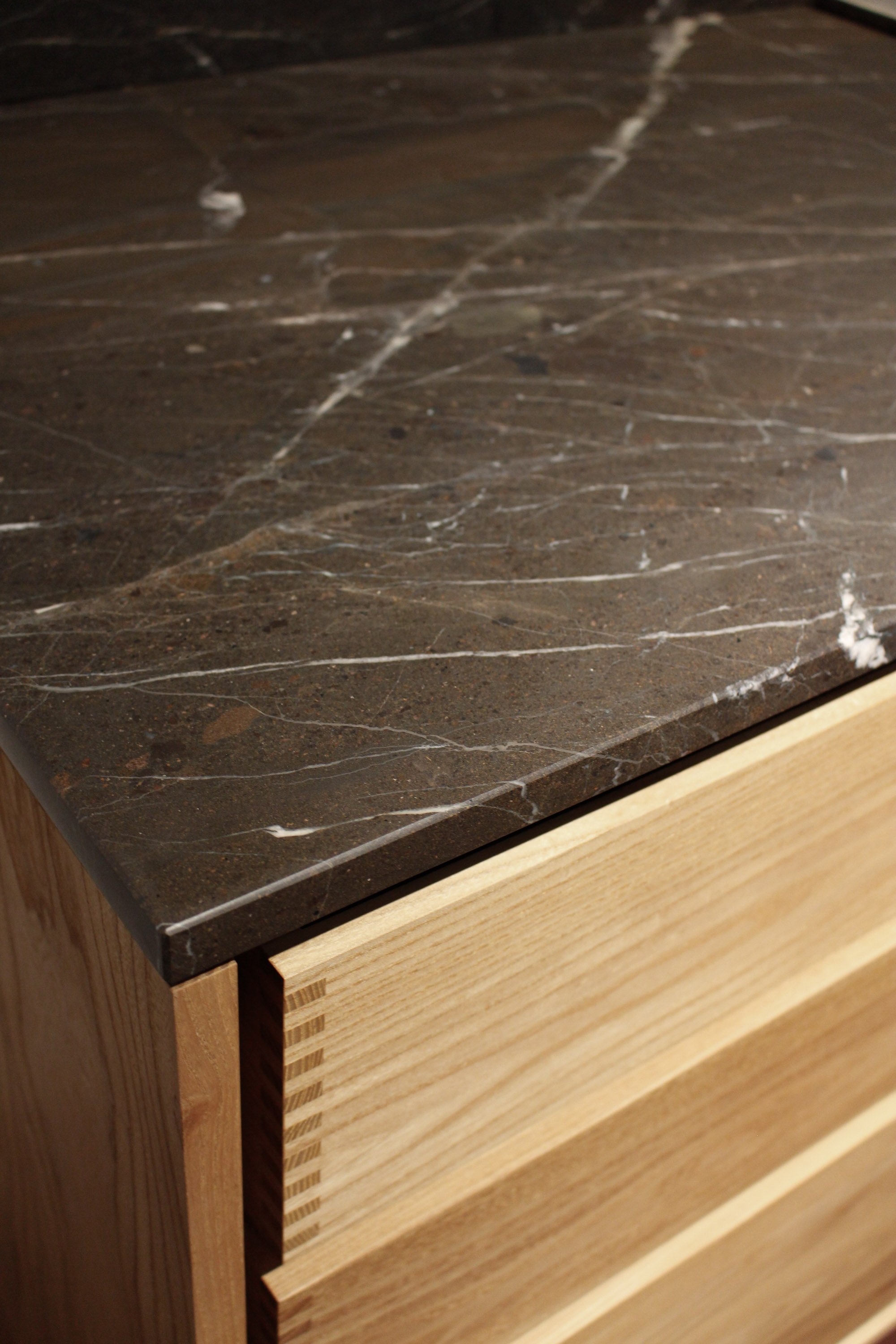
In CMF (Color, Material, Finish), priority shifted from introducing entirely new materials to drawing out the expressive qualities of existing ones. Deep brown and black wood grains, oil finishes offering a subtle sheen, and mirror accents contrasting with matte textures were prominent. In kitchens and bathrooms, combinations of black stone, timber, and Taj Mahal quartzite achieved a balance of solid weight and natural warmth.
Materials are no longer just specifications to be read; they are meant to be touched and felt through the shifting play of light. This method of communication itself became the spatial highlight.
Søuld
Søuld featured its eelgrass-based acoustic panels in "Composed Matter", an exhibition curated by Norm Architects. Through light and spatial design, the installation allowed visitors to directly experience the acoustic properties, carbon-storing benefits, and tactile qualities unique to this natural material. The styling prioritized conveying the material's aesthetic and universe, making a strong impression through atmospheric design.
Dinesen
Wood manufacturer Dinesen renovated the Gallery within its showroom to launch new wall and ceiling cladding. By continuously applying timber beyond the floor onto walls and ceilings, the material itself formed the architecture of the exhibition, allowing visitors to fully appreciate the rich grain, texture, and scale of the wood.
MUTINA
Ceramic tile manufacturer MUTINA unveiled its 2026 novelties: "Emisferi", a 3D ceramic module, and "Carrousel", a vase and mirror collection by Ronan Bouroullec. Both collections reinterpreted ceramics beyond surface tiles, treating them as sculptural objects and architectural elements. Constructing spaces out of ceramics effectively highlighted the material’s inherent appeal and creative possibilities.
Immersing in the Brand’s Universe
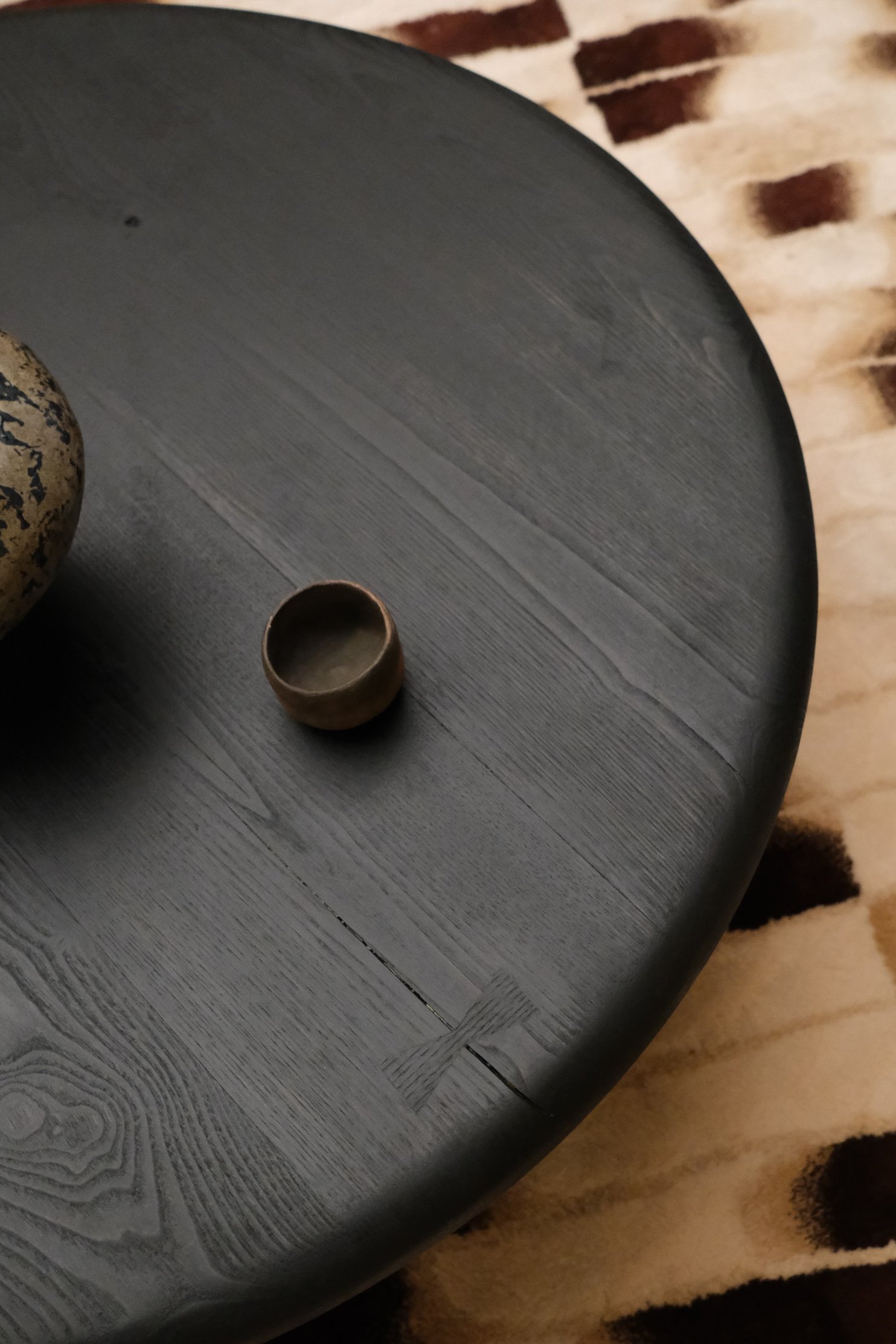
An increasing number of exhibitions moved away from reproducing practical domestic setups, choosing instead to abstract brand values into immersive installations.
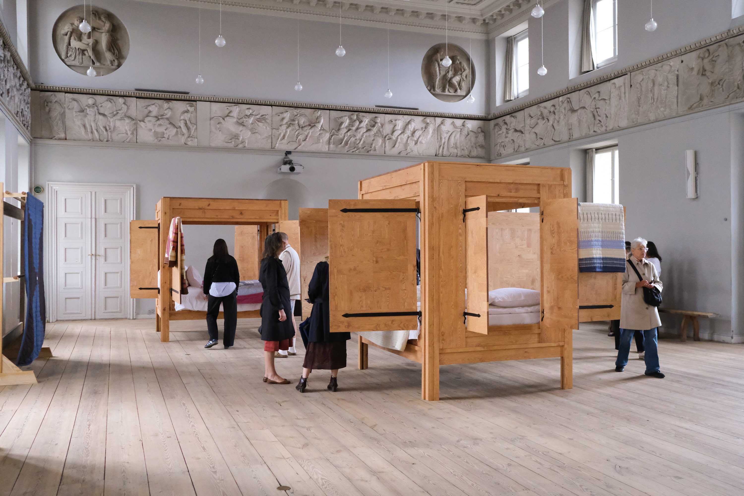
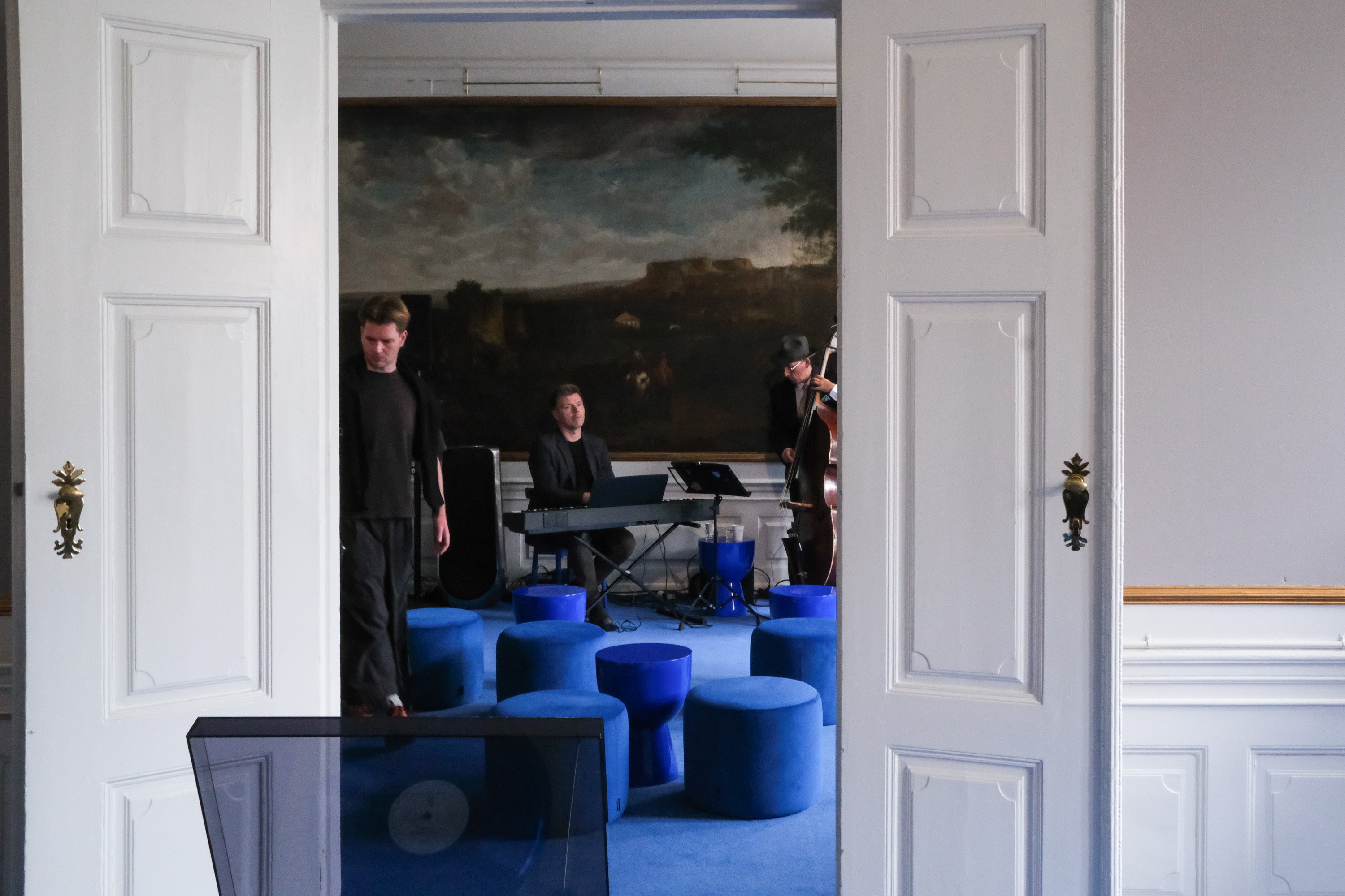
TEKLA used patchwork quilts and timber frameworks to evoke domestic memories and the transmission of craftsmanship. Bang & Olufsen transformed a historic mansion into a stage for listening sessions and live performances, making a lasting impression by focusing on the emotions and time experienced beyond the products themselves. FRAMA treated fragrance as a spatial design element, crafting a unique world where order and intentional discord coexisted.
Understanding a brand through light, sound, scent, and touch—exhibitions are evolving into experiential platforms designed to imprint a brand's philosophy deeply into memory.
TEKLA
Exploring the theme "The Heart of Living", TEKLA offered a contemporary reinterpretation of traditional Swedish patchwork quilts. By pairing these quilts with timber bed frames and hope chests, the entire space articulated memories of home and the passing down of craft heritage.
Bang & Olufsen
Bang & Olufsen transformed an entire historic mansion into a single, unified installation. Incorporating its products as symbolic elements within a surreal, dreamlike atmosphere distinct from real-world interiors, the brand expressed its unique vision. By integrating listening experiences and live performances, the display focused on emotional value rather than the physical devices.
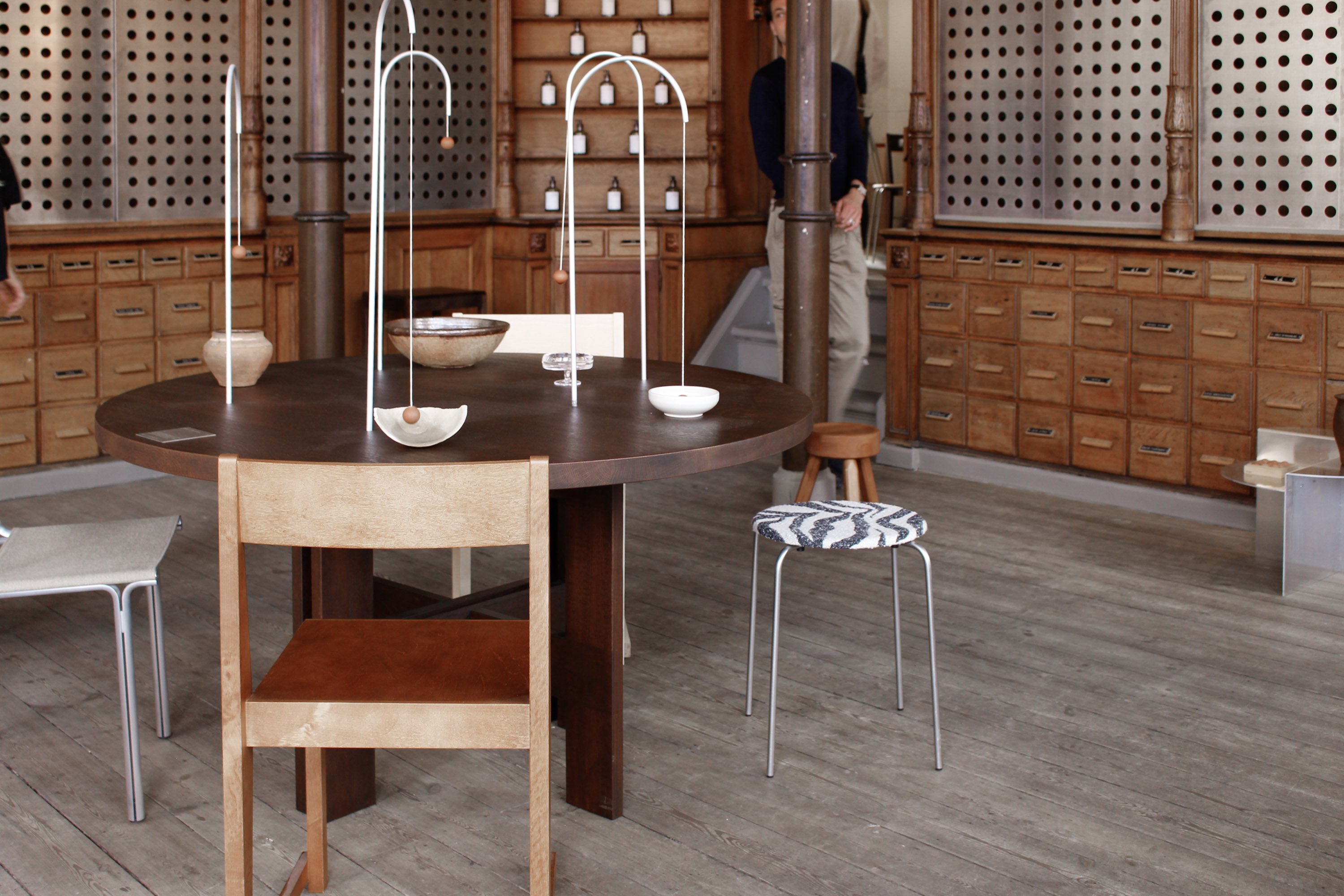
FRAMA
Marking the return of its touring exhibition "The Mechanics of Scent", apothecary brand FRAMA curated fragrance-focused displays across its Studio Store and Apartment 57a. Introducing "Scent Sculptures" for the first time, FRAMA proposed scent as an essential architectural element. Art pieces scattered throughout, everyday objects placed in intentionally intriguing locations, and neatly arranged products created a distinct universe where structure and subtle disharmony harmonized.
"Layers of Meaning" Born Through Layering
What emerged across this series of exhibitions was a consistent commitment to re-layering existing values from new perspectives.
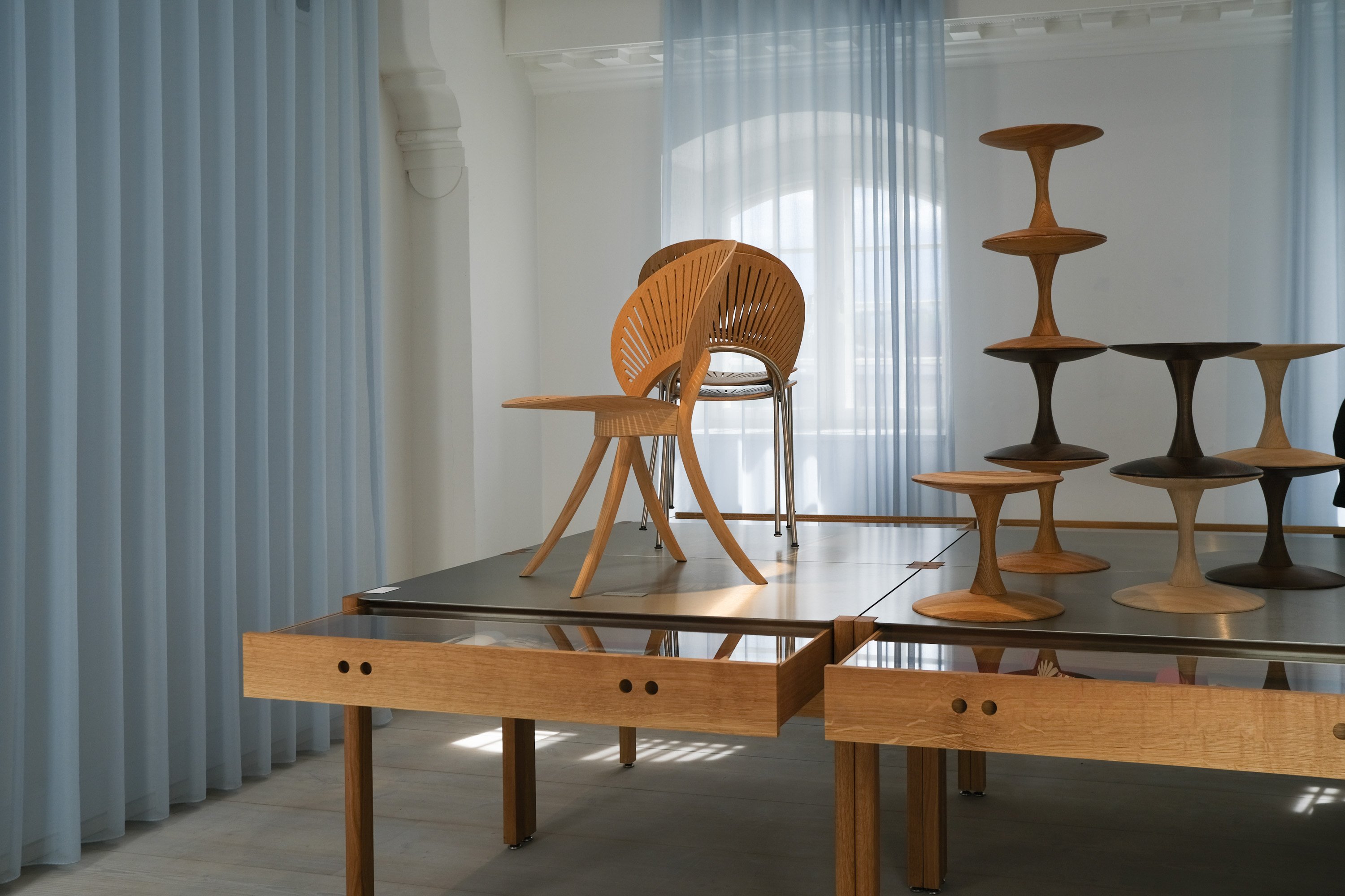
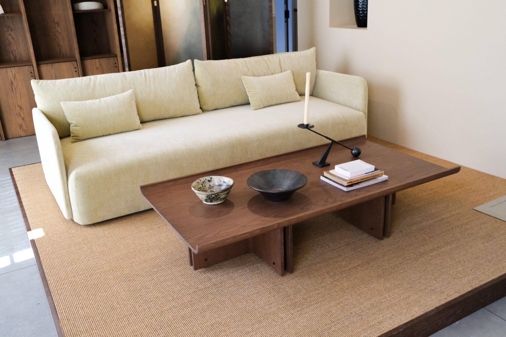
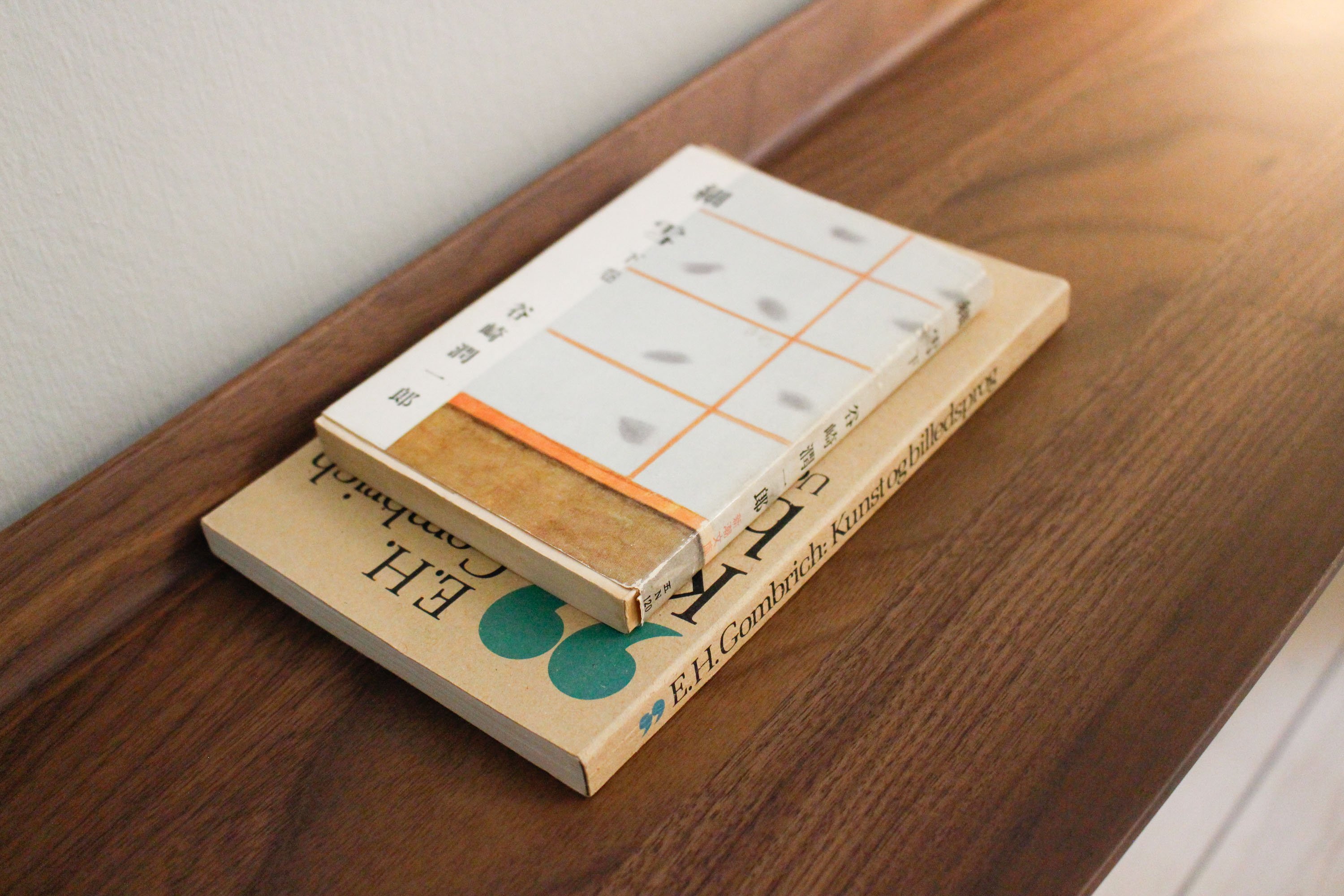
"Time"—layering heritage masterworks with new designs. "Materials"—layering sheer textiles and light colors over substantial wood and stone. "Culture"—reinterpreting Japanese and Asian elements through the lens of Nordic design principles. Japanese books, Go boards, and washi paper lighting were integrated naturally—not as exotic decorations, but as subtle components building the room's atmosphere.
3daysofdesign 2026 demonstrated that creating experiences where meaning gradually emerges is far more powerful than loudly declaring value. Thoughtfully editing familiar materials, heritage, and accumulated time to unlock undiscovered value offers invaluable inspiration for the future of spatial design.
This concludes TOPPAN's report on 3daysofdesign 2026.
This year's event strongly communicated the quiet, gentle, yet deeply grounded resolve of Nordic brands rooted in accumulated history. The living-oriented designs felt both novel and comforting, with multi-layered values bringing added depth to every concept.
Offering a distinct charm compared to Salone del Mobile, 3daysofdesign is scheduled to return during the same period next year. For those interested, planning a visit is highly recommended—you may just find design inspiration that stands unaffected by fleeting trends.
If you are interested in the details of this report, please feel free to contact us.
RECOMMENDATION
Overview of PSC (Premium Surface Collection) Wood Pattern Types
Milan Salone 2026 CMF | Quiet Depth Orchestrated by Materials
Milan Salone 2026 Flash Report | "Luxury of Silence" Sought in a Confusing World
2026 Interior Design Trends: The Radical Power of "Normal" − Why Primary Oak is Your New Secret Weapon
2026 Interior Design Trends: The Evolution of "Refined Tactility" and the New Standard, Yoguri
2026-2027 Lifestyle & Interior Design Forecast: Navigating Diverse Values and the Future of Living
Material Trial 2: Washi Opens a New Cycle in Sustainable Design − Upcycling Footwear Scraps with TOPPAN and New Balance
Salone Eucalyptus: Bold Elegance with a Contemporary Edge
Vento Walnut − Elevating Interiors with Sophisticated Flow
Milan Salone 2025: A Return to the Core of Design − Fumie Shibata, Piero Lissoni, and Nicholas Baker on the Future of Living
The Five Pillars of Exploration: A Deep Dive into Interprint's IP25
Redefining Decor Design: Interprint's IP25 Reveals a New Vision
Touch, feel, and let inspiration arise. Co−creation space TOPPAN "surface park™" opened!
The Very Best Dark Grey Colours For Wood: Interior trend 2025 Foschia Elm − A Whisper of Texture, A Touch of Craft
The Very Best White Colours For Wood: Interior trend 2025−2026 Mercury White: A Bright Woodgrain for Light−Filled Spaces
Redefining the Future of Surfaces: Our Vision at Interzum 2025
Designing "building décor materials" which make up our living spaces − Reproducibility and originality −
The Very Best White Colours For Wood: Interior trend 2025-2026 Margaret Elm − A Timeless Elm Design Bridging Classic and Contemporary
The Very Best White Colours For Wood: Interior trend 2025-2026 Skrilla Ash: Bold Calmness, Refined by Design
Interior Trends from 2025 to 2026 based on the Latest Lifestyle Trends
TOPPAN at interzum 2025
Milano Design Week 2025 News − Latest Trends and Key Points
Unravelling the Trends of the Global Market! 2025−2026 Grand Design Concept: In Sync, In Step
[Newsflash from Milano Salone 2024] Report on Design Trends
Heimtextil 2024 Report
DOMOTEX 2024 Trend Report
Milano Design Week Trend report Vol.1 1986−2023
2025 Interior Trend Forecast based on Lifestyle Trends

What Does It Mean to Be “Chosen” in the Age of Swipe Consumption?
CERSAIE 2024 Trend Report
Cersaie 2023 Report

